Shocking or entertaining? New cigarette warning labels for 2011
Canadian cigarette packages still leading the trend in pushing labelling limits
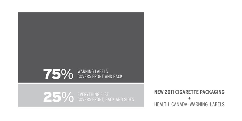
Canada’s cigarette packages are getting a makeover in 2011, with new warning labels featuring bigger and harder hitting images that will cover 75 per cent of the package.
The new warning labels from Health Canada will take about six months to get into full circulation, and will feature a website and phone number for people seeking more information.
According to Wendy Josephson, psychology professor at the University of Winnipeg, the images will have the most effect on people who are already looking for a reason to quit smoking.
“People who are actually in the process of quitting, the ones who are contemplating, will respond more positively to the new warnings,” she said.
Josephson noted that because of its addictive attributes, both physical and social, smoking is one of the hardest habits to kick.
“We know that people are always contemplating quitting – even people that smoke all the time have quit, often many times,” she said. “We also know that often everybody who quits has failed a few times before they actually quit.”
Canada’s packages started featuring full-colour photo warnings that covered 50 per cent of the pack in June 2001 and new warning labels have been in the works since 2003.
Josephson believes that, as with the old warnings, different labels will have a different effect on each person who reads them.
“With young people it’s generally the messages about short-term social and cosmetic consequences of smoking: bad breath, yellow teeth, impotence and things where other people are thinking that you’re not pleasant to be around,” she explained. “When people are older their thoughts are about the longer-term health effects.”
David Nowacki, a smoker and student at the University of Winnipeg’s Collegiate, believes that warnings should focus on things other than the associated health risks.
“I think you’d have to be especially ignorant these days to not know the effects of smoking,” he said.
From an advertising perspective, the new ads should work at garnering the attention of anyone who sees a pack.
“Increasing the size of an ad gives you more impact,” said Kenton Larsen, an advertising instructor for the creative communications program at Red River College.
Larsen explained that for some people the warnings will be effective, but for others they’ll become a novelty.
“It can make Canadian cigarettes ‘cool’ to buy,” he said. “The brand has less design power, but because the packaging is so different ... you can sell them on eBay; it’s a weird dual impact.”
For most smokers who are not thinking about quitting, the meaning of the warnings is something that often becomes normalized.
“At first it was a big deal when they put pictures on the smoke packs,” said Clarence Smith, an Osborne Village resident who has been smoking casually for the past 13 years. “But I really don’t pay attention to them anymore.”
Smith believes that the same thing will most likely happen with the new warnings.
“If people want to, they’re going to smoke regardless of what’s on the pack,” he said.
For this reason, Josephson advises that warnings be changed more often to keep the impact fresh.
“Changing the packaging regularly and making them clever to draw interest – it draws in the attention of the smoker,” she noted.
Published in Volume 65, Number 15 of The Uniter (January 13, 2011)


