Poster child for graphic design
Urban Ink show their colours in bold new exhibition, Dix Ans D’Affiches
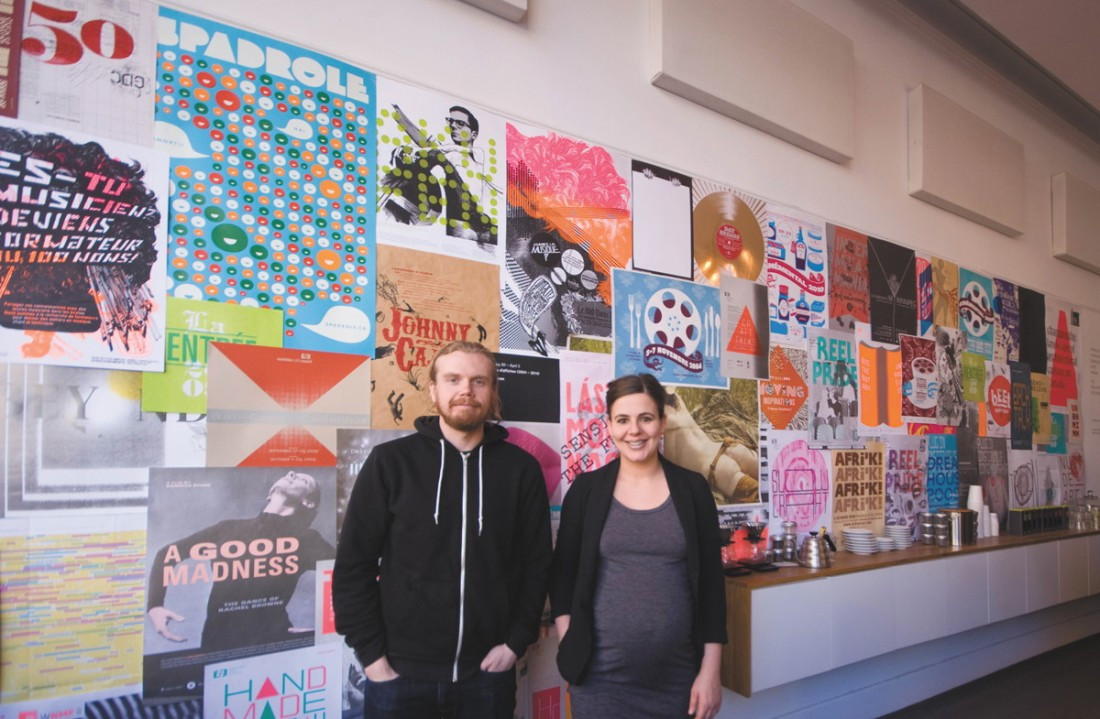
From L to R: Evan Marnoch & Marcelle Lussier of Urban Ink
Adara MoreauParlour Coffee received a colourful makeover at the beginning of February, which, to the familiar patron, may seem rather out of place.
For the past three years, the coffee shop’s art gallery has been nestled in the corner at the end of the serving bar. The art has been carefully curated, its standards on par with a gallery. Like every element of the space, the details are carefully considered and in great taste. This is exactly why, when approached by Marcelle Lussier of Urban Ink, Parlour’s owner Nils Vik was keen to host Dix Ans D’Affiches.
“I think the strength of doing this show now, and in the way that it’s been installed, is that it’s such a contrast from what we’ve done over the last three years,” Vik says.
The exhibition pours over the physical boundaries of the art gallery. Dozens of posters are presented in a controlled chaotic manner akin to their native territory of poster boards and lamp posts. The clean bordered edges of the display serve to soften the swell of visual information. Posters of all shapes, sizes and finishes display Urban Ink’s fondness for papers, sizes and print techniques not frequently used locally, Lussier explains.
The diversity of every visual element - from imagery to typography to printstock - displays a rich visual vernacular and a deep understanding of creating individual graphical identities. Dix Ans D’Affiches is more than a retrospective of Urban Ink’s poster work over the last decade, it’s a demonstration of what separates them from much of Winnipeg’s graphic design market.
Vik puts it bluntly: “I’d say most graphic design firms are just rubbish in Winnipeg. For the most part, the stuff I see coming out of graphic design firms is super derivative and just really market-driven and basically just copying what’s happening elsewhere.”
Tammy Sutherland, Program Coordinator of the Manitoba Craft Council, brings the client’s perspective to bear.
“Urban Ink makes us look really, really good,” Sutherland says. “They get what our organization is about and have definitely played a role in shaping the public’s view - and even our own view - of what the Manitoba Craft Council is.”
From Sutherland’s vantage, Urban Ink has helped shape more than the identity of the Manitoba Craft Council. Their well-crafted presentation of the organization has shaped the activities of the organization as well. “Their aesthetic vision pulls us into new territory. It gives our organization a strong visual identity that sets us apart and pushes us to create programming that lives up to our promotion.”
The implementation of screen printing is one of the many things that differentiates Urban Ink’s prints from those of other firms. There is a lavishness and personality to it that alludes to their character. Screen printing is artisanal and incredibly impactful, an investment that yields a direct reward.
Vik describes Urban Ink’s work as sparingly as he makes his coffee.
“They’re uncompromising.”
Published in Volume 69, Number 23 of The Uniter (March 4, 2015)