Kultivation cultivates Filipino culture
Filipino contemporary art to take over the Exchange
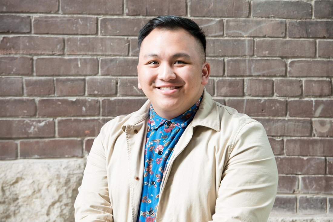
Patrick Eulalia is part of the organizing committee for the upcoming Filipino cultural fest Kultivation Festival.
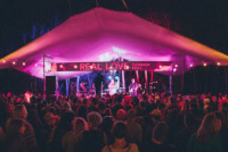
Photo by Keeley Braunstein-BlackAfter a successful – but COVID-19 interrupted – popup in the Garden City Shopping Centre, Kultivation Festival, which celebrates the contemporary art of Filipino people in Winnipeg, will take place in the Exchange District in June.
Patrick Eulalia, one of the members of the organizing committee and the chair of social media for the festival, says it’s a way of celebrating Filipino contributions to Winnipeg that go beyond STEM (Science, Technology, Engineering, Math).
“I think, as a culture, we often only see Filipino people celebrated when they’re pursuing particular industries, like healthcare work or engineering, but we don’t really get a lot of spotlight on people doing things outside of that, like really cool chefs, bakers, artists, dancers,” he says.
Part of the goal of Kultivation is to imagine what a Filipino district of Winnipeg might look like.
“With the development of the Jollibee (a Filipino fast-food chain restaurant) being the first to open here and the recent Seafood City opening, I think it’d be a great opportunity to open a district to mentor our youth about our culture,” Eulalia says. This could include teaching Filipino cooking and language, as well as providing mentorship, especially in industries outside of STEM.
Jonato Dalayoan, who owns 4Two Design Inc. and was commissioned to design the branding for the festival, says that being involved in the project has really been transformative for him. While Dalayoan says he started off seeing Kultivation as just another job, though one within his community, “it’s gone beyond branding. Branding is very important, but understanding the culture more and more has helped along the way as well. It’s definitely been a learning experience for me.”
Dalayoan says his logo design was “inspired by Filipino textiles and the prairies. Although we’re recognized as Filipino here, we’re in Canada. I kind of used textiles as inspiration, but I also used aerial views of our prairies.” He says the colour scheme was inspired by the Filipino flag but also skewed to be unique.
An upwards arrow is also a key part of the logo. He says “the arrow was kind of intended to show a positive, uplifting feeling, but at the same time, it kind of represents the migration from east to west as well.”
He says that the branding needed “to be bold, energetic, strong and with unity. It’s a very joyful culture, and I wanted to make sure it was represented that way, with a kind of fun feeling.” He also notes that, with so many other summer festivals, it needed to really stand out from the rest.
Dalayoan says he wasn’t so sure about the concept of a separate Filipino district and the idea of segmenting the city, “but that said, the more I learned about the festival and thought about the future, it’s not so much segmenting or isolating, but it’s a way to celebrate our culture and share it with the community, and I think that’s the most important thing.”
He also says that being part of the festival helped him to contextualize his own experience as a Filipino-Canadian. When he reflects on the fact that his kids can’t speak Filipino but can speak fluent French, he says “this is for them. It’s to give them a sense of pride, that it’s okay to share your culture, and you should be proud to share your culture.”
Published in Volume 74, Number 22 of The Uniter (March 19, 2020)